Custom Visuals allow users to create their own data visualization logic to draw query results using representations that are not covered by the built-in library of standard charts and visualizations.
Custom Visuals are designed in concert with the Custom Visual APIs to program the way the engine will draw the query results to screen. Custom visuals can be created in Formulate, added to a discovery in Discover, which can then optionally be included in presentations or publications.
Note: This feature is only available with Enterprise licensing.
Building a Custom Visual
Before you begin
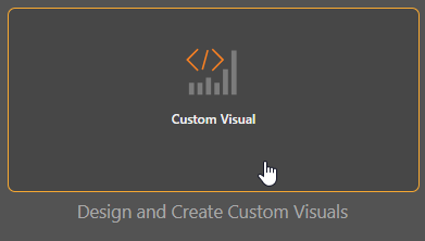
To open the custom visual builder, go to Formulate, select Custom Visual, and then choose your model. To start, you may want to choose the sample data model to use for testing your custom logic:
The Custom Visual wizard opens, where you can build your visualization.
Note: You can click Apply at any point to see a preview of your custom visual, however, you must be sure to add hierarchies and measures to the query if you want to see a preview.
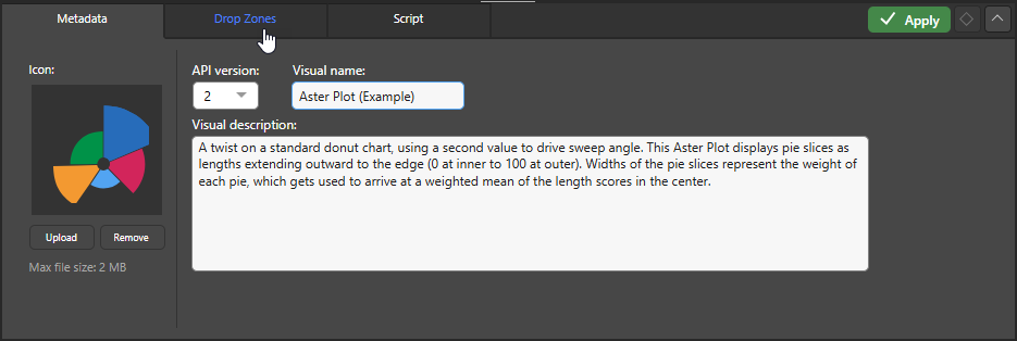
Step 1: Supply Metadata
From the Metadata panel, you can name your custom visual, add a description, and upload an icon:
You are going to work through the Custom Visuals wizard's tabs, starting at the Drop Zones tab.
Note: The example used in this task shows the creation of an Aster Plot custom visual. This out-of-the-box custom visual has been downloaded from the Marketplace and renamed.
Step 2: Configure Drop Zones
Click the Drop Zones tab. This is where you can specify the visualization type to use for your custom visual, and define the drop zones that should appear when your custom visual is selected in Discover:
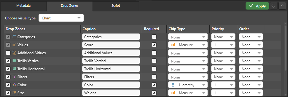
- Use the Choose visual type dropdown list to select the visualization type that you want to use for your custom visual.
- Use the checkboxes in the Drop Zone column to select the drop zones that you want to see in your visual.
- You can then define the Drop Zone details for each of the drop zones that you have enabled in the grid.
Tip: As you change these values, you should keep clicking Apply. This will refresh your preview on the canvas, and also the preview Drop Zones panel.
Drop Zone details
Caption
The name of the drop zone when it is used for this visualization type. By default, this matches the name of the drop zone but, if your custom visual type is a type of business diagram, you might want to override these names to help your user to understand how their hierarchies and measures are being used.
Required
Select Required if the custom visual shouldn't be drawn if there is no chip in this drop zone.
Chip Type
Choose whether the specified drop zone should contain a Hierarchy or a Measure. If you should be able to add both hierarchies and measures to the drop zone, choose None.
Priority
Select the priority of the drop zones for each chip type. This affects the sequence in which hierarchies or measures are added to the drop zones as they are selected.
For example, to assign the first Hierarchy chip type to Columns, the next to Rows, and the last to Filters, you should assign a Priority of 1 to Columns, 2 to Rows, and 3 to Filters. Given this configuration, when you double-click hierarchies in the Dimensions panel in Discover, the first chip is automatically added to Columns, the second to Rows, and the third to Filters.
Order
If you want to show the Drop Zones in an order that is different to their order in this panel, you should use the Order dropdown list to specify that order.
For example, if you want to show Colors as the second drop zone after Categories, you should specify that Categories has an order of 1 and Colors has an order of 2.
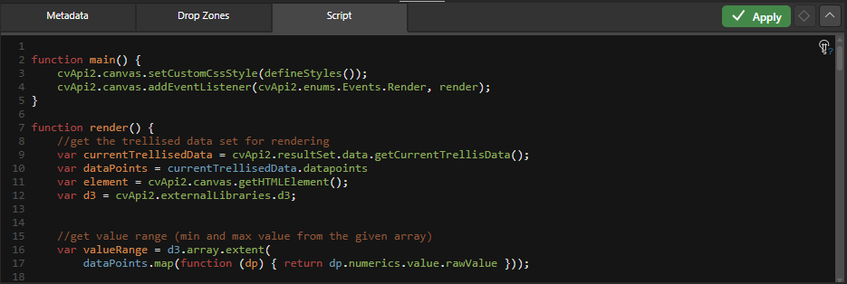
Step 3: Create your Script
From the Script tab, you can write the script for your custom visual. You can also download a custom visual script by opening the Marketplace in the ribbon. Click Apply to apply changes to the preview.
![]() Use the Explain Script function to produce an AI-generated explanation of what the script does (note this is available even if the script was not itself AI-generated). Note: Each time you click the Explain Script button, a new explanation is generated. For more information, see Explain Script.
Use the Explain Script function to produce an AI-generated explanation of what the script does (note this is available even if the script was not itself AI-generated). Note: Each time you click the Explain Script button, a new explanation is generated. For more information, see Explain Script.
Tip: You could copy this explanation and paste it into the node Description field, for example.
Step 4: Use the Custom Visual in a discovery
When you've finished configuring the visual, click Save above the canvas. Your visual is saved to the CMS.
Once you've saved your visual, it will appear in the custom visuals pop-out from the Toolbox in Discover, and can be selected as a visualization type when you are creating a visual:
You can access the custom visual's logic from the CMS. The asset is saved under the name given when it was saved to the CMS. Like other assets, you can open it, edit it, and open its Actions Panel.
Custom Visual Scripting and API
There are two ways to create custom visuals:
- Download a visual from the Marketplace (in the ribbon) for a fully scripted solution
- Add your own custom visual script in the Script panel
You can add your own script from the Script panel. The template in the Script window contains several API functions. Of these, the MyCustomVisual function must be implemented, and the custom visual must be built in one chunk (not trellised).
You can reference any other external JavaScript library to build your own visualizations, including D3, High charts, and Plotly.
It is important to understand that blue chips (hierarchies) affect the number of data points in a query, but orange chips (measures) don't.
- Refer to the Custom Visual API documentation for more information.
Custom Visual Marketplace
The Custom Visual marketplace includes many charts that have been either developed by Pyramid or by Partners. These chart types are included out of the box with the product deployment and operate like any other normal chart included in the product. They represent examples of how to develop a custom visualization using the API.
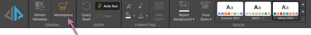
To view and select a Custom Visual from the marketplace, click Marketplace in the Ribbon:
The Marketplace dialog opens. Note that you can search for and use tags to find the Custom Visual you are interested in.
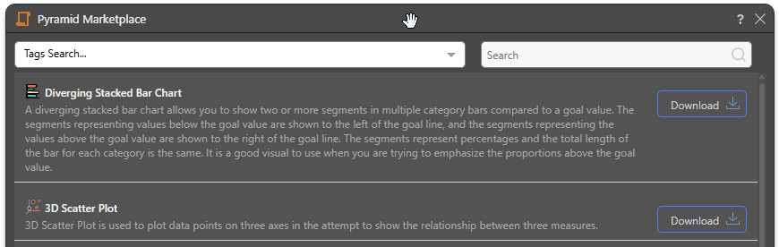
Click the Download button to open the Custom Visual wizard and populate it with the Metadata, Drop Zones, and Script content associated with your selected custom visualization type. The following out of the box Custom Visuals are typically available from the Marketplace:
- Diverging Stacked Bar Chart
- 3D Scatter Plot
- Aster Plot
- Heat Grid
- Measure Waterfall
- 2D Density Plot
- Tabular Grid
- AG Grid
- Scroller
- Data Card
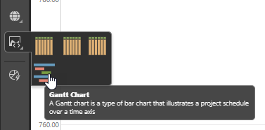
- Gantt Chart
- Chord Diagrams
- Network Diagram
For more information about these Custom Visual Types, see Custom Visuals in Discover Pro.
Securing Custom Visuals
By default, all users will see your custom visual in Discover, even if it was saved in My Content. If you want to limit which roles (and, therefore, which users) can create and view them, you can specify permissions for your custom visuals from the Profiles tab in the Admin console.